
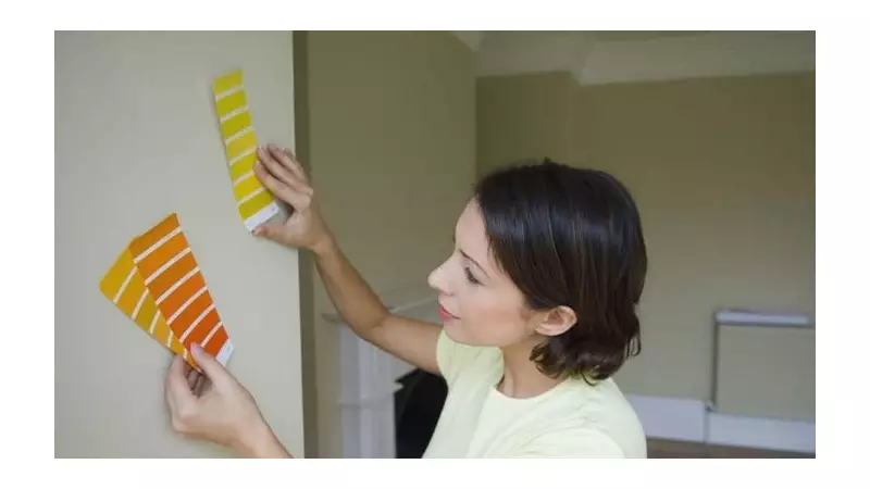
As the new year unfolds, a familiar restlessness for change takes hold in homes across the UK. With Christmas decorations packed away, every scuff mark and chip in the glosswork seems to demand attention, sparking a national urge to redecorate.
The Science Behind Your Colour Scheme
According to Professor Geoff Beattie, a psychology expert at Edge Hill University, selecting paint is far more than an aesthetic decision. In a detailed analysis, he explains that colour wields significant influence over our emotional state, cognitive abilities, and even long-term psychological health.
The hues we choose operate through a complex mix of evolutionary instincts, physiological reactions, and cultural learning. This means the shade on your walls could subtly shape your mood, sleep quality, and social interactions without you ever realising it.

Navigating 2026's Trend Palette
Major brands have already set their sights on the colours of tomorrow. Dulux is championing a versatile family of indigo blues for 2026, with shades like Free Groove, Slow Swing, and Mellow Flow designed to evoke feelings of 'stability, fluidity and boundlessness'.
Meanwhile, other forecasters point towards chocolate brown and burgundy as rising stars. Notably, Ikea has declared 'Rebel Pink' its colour of the year, describing it as a vibrant, playful shade meant to inspire joy and self-expression.
However, Professor Beattie advises caution with ultra-bright tones. For long-term comfort and wellbeing, low to mid-saturation shades are often psychologically preferable. He highlights blue and muted green, in particular, for their links to enhanced creativity and improved problem-solving skills.
Applying the 60-30-10 Rule
A classic interior design principle offers a practical framework for applying this colour psychology. The 60-30-10 rule suggests dividing a room's colour scheme into three parts: 60% for a dominant colour, 30% for a secondary shade, and 10% for an accent colour.
While its connection to the mathematical 'golden ratio' is debated, the structure helps create a balanced and visually appealing space. For example, a living room might use soft sage green as the dominant 60% to promote relaxation, a warm cream for 30% to add cosiness, and brushed gold as the 10% accent to introduce a note of confidence.
Professor Beattie offers specific guidance based on psychological research:
- Blue: Associated with sky and water, it has a calming effect and can aid concentration, making it a strong candidate for home offices.
- Muted Green: Its connection to nature supports mental restoration and reduced fatigue, ideal for studies or creative spaces.
- Red: Use with caution. While it can increase arousal and even perceptions of attractiveness, it is also linked to danger and can impair performance on tasks requiring focus.
- Neutral Tones: Whites, greys, and beiges reduce sensory overload but can feel sterile or sad if the shade is too cold or the room poorly lit.
The key takeaway for anyone contemplating a home refresh in 2026 is to look beyond mere fashion. The colours you choose will become a constant, silent backdrop to your daily life, with the power to influence your mind in profound ways. It’s not just about what looks good now, but what will feel good for years to come.